Card Control and Data Grids |
  
|
Card Control and Data Grids |
|
Card Control
Card Control is used to enter groups of similar items, in most cases to enter contact information in modules such as Accounts Receivable. The arrows at the bottom of the control allow the user to go to the first, previous, next and last records entered. The last button in the sequence at the bottom of the control is a right-facing arrow with an asterisk  , and is used to add a new record.
The fields are further defined:
Field |
Description |
|---|---|
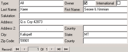
Last Name |
Enter the contact's last name. |
First Name |
Enter the contact's first name. |
Type |
Define the specific correspondent level for the contact, which is used to print reports/letters for groups of contacts:
All: Generally used to denote an owner Billing: Selects a contact to receive a generated statement or coupon Contact: Defines a person that may call to discuss an account who generally does not receive billing Collection: Defines a contact record assigned to a deed and used primarily for collection letters Mailing: Defines a mailing contact for newsletters and other non-billing information Management Company: Defines the management company for the unit and is included on compliance letters Tenant: Defines a tenant contact
|
Address, City, State, Zip Code |
Enter the contact address, which may be different from the unit address. |
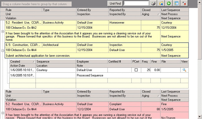
Data Grids
Used to organize and maintain printable groups of records, this control appears frequently throughout the software, though the specific fields will vary according to the type of information being entered. The following grid is from the Compliance module and allows the user to complete various tasks.
•Clicking on the title of each column in the grid allows the existing records to be sorted by that category. In the compliance module, the user can choose from categories such as Type, Rule and Entered By; clicking on the Type column will order the list alphabetically by type, and so on. The arrow indicators  denote the order sequence, as in the Aging column in this example, which is sorted in ascending numeric order (low to high).
•Many of the grids allow the user to group items. This is accomplished by dragging a column into the box labeled "Drag a column header here to group by that column" at the top left-hand side of the grid. Click and hold on a column and drag it to the box to group all items in the list by the column selected. For example, if the user drags the Type column, the program will group all compliance items by the type. To set the grid back to its original state, drag the column name out of the box.
•Special toolbar items are located at the top right-hand side of most data grids in the software. The tools will be further described as they appear in later sections of the software, but most will share some common features: a printer icon, which allows the user to print the items contained in the grid, and a plus sign (+) to the left of each row, which indicates that more information ("child data") is attached to the parent row; clicking the (+) will expand the data.